The push button transmission wasn't the first attempt to endow a dashboard with a unique user experience. For instance, in the late 1930s, Plymouth introduced a "safety speedometer" that glowed red when you exceeded 60 mph.
But you know what's amazing? It's been 80 years since the debut of the safety speedometer and 65 years since the debut of the push button transmission, yet car makers continue to use the dashboard as a platform for product branding and differentiation. For evidence, consider the many in-dash infotainment systems now available on everything from BMW roadsters to Ford F-150s.
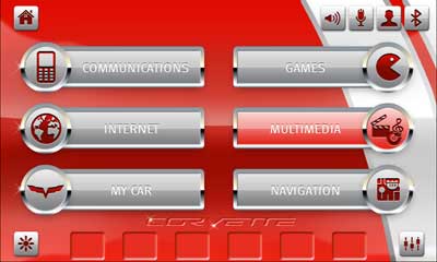
 |
| A glimpse of original UI for the Corvette's QNX-powered head unit |
To answer that question, we created the "30 day" UI challenge. In a nutshell, we gave Lixar, a mobile UI company with no QNX or automotive experience, a month to create completely new skins for the QNX-powered head unit on the Corvette.
So how's the project going? I thought you'd never ask:
Which skin is in?
The above video is the second of a series. Will we see the final skins in the next installment? Pretty sure. But in the meantime, here's a closer look at the draft skins shown in the clip. Clearly, the designers are looking to capture the spirit of the Corvette while offering a clean, easy-to-learn UI.
Personally, I find all of them attractive... still can't decide which I like best. Do you have a favorite?


14 comments:
The second one is not attractive, the third one is not readable.
The first one seems like the best choice, but the color scheme puts the focus on the wrong place.
The readability of the third draft skin took at hit when it was photoshopped it down to size for this post. I've seen the original, and it was much crisper. - Paul
Um, make that "take a hit" rather than "take at hit". Sorry about that.
I objected to the third one because I believe the text and background are not contrasted enough (especially if you have to read it with a lot of sun), but if that's a photoshop mistake, I retract it :)
Well, actually, I think we're both right. The original is easier to read, but a contrasting text color would pump up readability, nonetheless. In any case, let's see which skin wins! :-)
#2 Please... No Contest!
Oh come on! N. 2 is chaotic and not quickly readable!
(btw, Paul, sorry for being so blunt)
Well, Cyril, I did ask for everyone's opinion! :-)
I agree with Cyril. The first one is structured, legible and sets a framework for users to quickly find the function that they are looking for (read: minimize driver distraction). This format also sets a clearly defined framework for sectioning off functions that could be easily repurposed or used on subsequent screens. The red at the top does draw your eye away from the key content area. Iconography in #1 also sets the stage for an intuitive and consistent visual language.
Thanks for your input, Ian! This conversation makes me think about how important "reskinnability" is.
The same UI will generate very different responses from different users. Thus, there's probably real value in being able to: a) adapt a UI or skin to the needs of different users or classes of users, or b) let users choose the skin they personally find the easiest or least distracting to use.
Of course, the value of this flexibility partially depends on the device and market in question. In safety-critical environments, for instance, you probably don't want people to create or download their own skins! But you do want the ability to quickly modify the UI if the modification would make the system safer or less risky to use.
I realize I'm more than a tiny bit late in responding to this, but... well... I can't pass up giving my thoughts. :)
Agreed with Cyril and Ian. The problems with #2 and #3 are pretty definite. #1 is a bit more subtle in its shortcomings.
Aside from the main 6 buttons, there are far too many ambiguous icons. What's with the mixing board -- EQ and balance ? That should be part of the main sound button, not a separate one. What's with the silhouetted people ? I doubt it's IM or Facebook friends... in a car cause... like, that'd be weird ;) so I'll presume it's contacts. Why do I care about my contacts separate from Communications, and even if I do, doesn't it seem reasonable that I'd look under communications for my contacts ?
I have no solid idea what lightbulb is.
So the problem is any time I have to use the interface, I'm have to make a tremendous number of micro-decisions. There are roughly 6 different areas I need to assess individually, and from there, subdivide them down further and further until I can arrive at what I want to do. That's a lot of focus diverted from driving.
Ultimately, in an application like this, it's much better to make very small progressive decisions one at a time rather than a whole mess all at once; for example, as previously mentioned, remove the EQ mixer icon and make it accessible via the sound page. That way, me, driving: "Oh, too much bass. This is... sound related." By the time I've made it that far, I've found the *one* icon that conveys sound/audio. No secondary decision/split to make. "Oh, traffic's picking up" now I can focus on driving while the partial effort I've made to change the EQ persists. When traffic lighten up a bit, I can resume where I left off rather than have to search and decide on all the icons again.
Another minor issue is that the 6 main buttons are seemingly arranged at random; Western culture design, we read top-down, left-right. That's how we visually approach things unless there's something drastically drawing us to divert. So why is the top-left button "Internet" ? Especially taking into account that it's *also* on the driver's side in the US/CA... Of all things, I doubt the internet is what I'd be searching for most of the time. Perhaps Navigation or My Car.
In the spirit of not liking to talk, I did an alternative mockup. Just for fun. :)
http://derekmounce.com/qnx-mockup-nav.jpeg
http://derekmounce.com/qnx-mockup.jpeg
First shows what would be a slide-down notification/contextual information area.
Second shows an absence of said notification area.
Anyway, that was too long. Oh wow, way too long. ;)
-=Derek
Derek, I love your thoughtful comments -- great stuff. And I have to say this is the first time anyone has commented visually on my blog!
A couple of things come to mind. First, I need to sit down in the Corvette to remind myself what some of those icons do! (In the meantime, I'm hoping that one of my colleagues who is more familiar with the UI can enlighten us.) Second, your comments, along with the comments that Ian and Cyril provided, underscore something important: It can take a lot of effort, thought, imagination, knowledge, and testing to create a UI that works for most users. You're damn lucky (and just plain brilliant) if you get the UI right on the first try. Thus, having an environment that lets you quickly prototype or finetune different approaches is super important if you want to ship your system in a timely fashion.
Nice, clean designs, btw! I'm not a graphics designer or a UI expect, but I like your approach.
Glad you enjoyed. :) Which design did you guys finally go with, btw ? It's a shame that in the videos you don't get a really good look at the final result, just some quick glances.
Any plans of a more in-depth nerd-out video ?
-=Derek
Derek, I hope to post screen captures of the final design next week. Stay tuned.
Post a Comment